There are different types of plots in Harmony, and often the plots that are available for viewing depend on the datasets currently displayed.
For example, you can select a plot type from the drop-down menu in the Diagnostics tab:
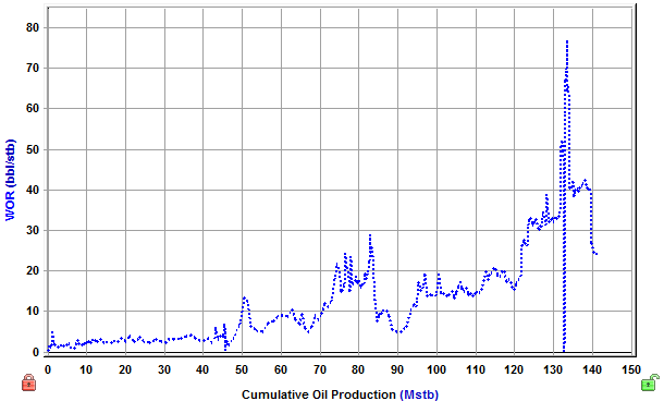
Coordinate (also called 'Cartesian') plots display data in a 1:1 ratio with no manipulation of the axes.
An example of a coordinate plot:
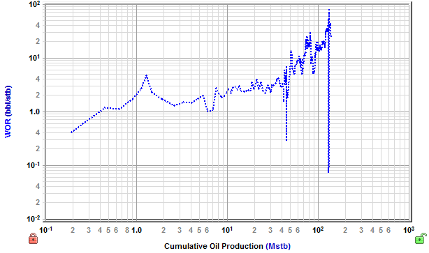
Log-log plots use logarithmic scales on the x- and y-axes to stretch data in order to view trends in the data that are not apparent with Cartesian coordinates.
An example of a log-log plot:
In log-X plots, the scale of the x axis increases exponentially. Manipulating the y-axis in this way places emphasis on a specific portion of the data set (for example, semi-log time emphasizes early-time data).
An example of a log-X plot:
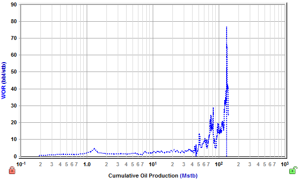
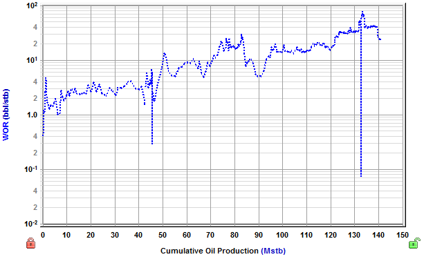
In log-Y plots, the scale of the y-axis increases exponentially. Manipulating the x-axis in this way normalizes a large range of data that is difficult or impossible to analyze on a coordinate plot.
An example of a log-Y plot:
IHS Harmony Enterprise™ 2017.3 | Last revised: October 18, 2017
Copyright © 2017 IHS Markit Ltd. All rights reserved.