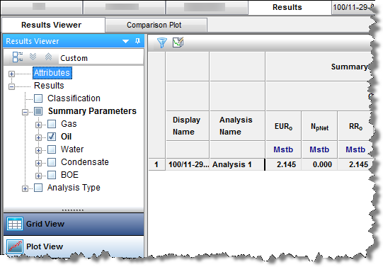
The Results tab consists of three sub-tabs: the Results Viewer, Comparison Plot, and Reporting. (The Results Viewer opens when you click the Results tab.)
Results Viewer sub-tab
The Results Viewer has two buttons at the bottom of its pane: Grid View and Plot View.
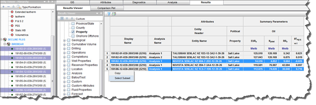
Grid view
The Grid View displays attributes and results in a table / grid based on selections in the Entity Viewer - Hierarchy or Custom Groups panes. As you change selections, the grid columns are retained, but the entities and their analyses are updated.
The grid is empty until you select attributes and parameters to be displayed. Columns are added to the grid by selecting checkboxes from the tree structure on the left. After you have created a selection of columns in the grid and customized them, you can save it as a template by selecting Save / Delete Template from the drop-down list above the tree structure.
Clicking a column header sorts the table data by its attribute value, according to the same sorting rules MS Excel uses. For alphanumeric attributes, numbers are sorted first from left-to-right (instead of top-to-bottom), then special characters, and finally letters. Apostrophes and hyphens are ignored except when there is text with a hyphen. In this case, the text with the hyphen is sorted last. If you click a column header, and then press the Ctrl key, you can sort multiple columns at the same time. This is indicated by a sorting arrow in each of the columns.
Plot view
The Plot View displays the axis parameters you select from the tree structure in a plot; you can plot attribute and result values to analyze relationships between input and output parameters. If you are only plotting attribute values, you do not need to perform an analysis. For a description of plot options, see plot components.
To build the plot for the currently selected entity, select the parameters / datasets you want to display by selecting the appropriate checkboxes in the Results Viewer pane (tree structure). Or, you can drag-and-drop the parameters to the plot.
| Tip: | You can send your plot to a comparison plot, by right-clicking it and selecting Send Plot to Comparison Plot, or you can right-click and select Send Dataset to Comparison Plot. For information on other options, see plot options. |
There are two plot types: cross plot and cumulative distribution function (CDF).
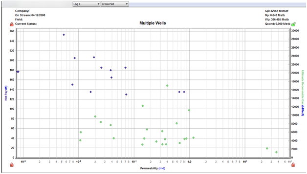
Cross plot
A cross plot displays data as a collection of points, each having the value of one variable determining the position on the horizontal axis, and the value of the other variable determining the position on the vertical axis. This is also known as a scatter plot. These plots are most commonly used for identifying trends or relationships between different variables.
Results can be added to the cross plot by clicking the checkboxes in the tree structure on the left, or by dragging results to the desired axis. Multiple results can be plotted on the y-axes, but only one result can be plotted on the x-axis at a time. (Date variables can only be plotted on the x-axis.)
CDF
A CDF calculates the probability that a random variable with a given probability distribution is found at a value less than or equal to "x".
Only one result variable can be plotted on a CDF plot at a time, and results can only be added by clicking the appropriate checkboxes in the tree structure on the left. If a result variable is already selected, making another selection replaces the current selection.
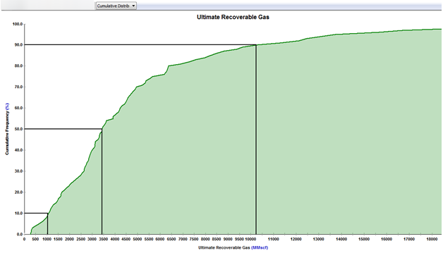
The black horizontal lines originating at cumulative frequencies of 10%, 50%, and 90% intersect the CDF curve, and then line up with the P90, P50, and P10 values of that dataset, respectively.
Toolbar
The important icons are described below. For a description of common icons, see toolbars.
- (Grid View and Plot View) Save / Delete Template — is the default setting, but you can select you saved templates with the plot selections / datasets you prefer.
- (Grid View and Plot View)
 Analysis Filtering — lists the analysis names that exist for the currently selected entities. Deselecting an analysis name removes all analyses of that name from the plot or grid for all entities. By default, all analyses associated with the selected entities are displayed.
 - (Grid View) Bulk Edit Declines — you can edit decline parameters for all the selected wells as a group. For more information, see bulk modify decline analyses.
- (Plot View)
 Search — after specifying search criteria, the tree structure filters the results to only display parameters that match. The search considers both the description (for example, the initial rate) and nomenclature (for example, qi) for each parameter.
 - (Plot View)
 Select data points — you can select data points, and then to exclude any you do not want, right-click them (to deselect them).
Context menus (grid view)
Right-clicking the top left of your table lists these options:
- Copy Grid — copies the table to the clipboard.
- Copy Grid + Headers — copies the table and table headers to the clipboard.
Right-clicking table headers lists these options:
- Precision — select between decimal, scientific, or engineering.
- Units — select the units you want to display from the submenu.
After selecting one or more rows in your table, you can right-click the row numbers to the left and select Select Subset. This removes the other rows in the table, and this selection persists across Harmony Enterprise (for example, the Entity Viewer, GIS map, and so on).
By right-clicking a table cell, you can copy / paste the table cell's contents.
Comparison plot sub-tab
In the Comparison plot, you can combine plots and/or datasets from many Harmony Enterprise plots. Comparison plots are static (a snapshot of a point in time), meaning that the plot does not change even if the source plot / dataset is modified. This can be useful to compare plots of slightly modified datasets or scenarios, and to compare analyses between entities. Each tab in the Comparison plot contains a separate plot.
Plots created within the Comparison Plot tab are user-specific, meaning they are not shared with other users. The plot and its axes and datasets can be customized, and these changes persist with each plot (such as line / symbol properties, axis title, color, and so on).

Toolbar
The unique icons are as follows:
-
 New Plot — opens a new blank tab to the right of your existing tabs.
 -
 Copy Plot to New Tab — copies the content of your existing plot to a new tab.
 -
 Paste Plot from Clipboard — pastes the plot in the clipboard to the current tab.
When an axis is added, if it has the same units as an existing axis, they are linked (default setting). -
 Copy to Clipboard — copies the plot on the current tab to the clipboard.
 -
 Delete Current Plot — deletes the current tab you are on.
 -
 Add an Arrow Annotation — adds an annotation arrow to the data point you click.
 -
For a description of common icons, see plot toolbars.
Tab context menu
Right-clicking the tab below the toolbar lists these options:
- New Plot — opens a new tab to the right of the existing tabs.
- Copy Plot to New Tab — copies the content of your current plot to a new tab.
- Paste Plot from Clipboard — pastes the plot / dataset in the clipboard to the current tab.
When an axis is added, if it has the same units as an existing axis, they are linked (default setting). - Copy to Clipboard — copies the plot on the current tab to the clipboard.
- Delete Current Plot — deletes the current tab.
- Rename Tab — opens the tab's name field where you can type a new name.
Plot context menu
Right-clicking within a plot lists these options:
- Paste plot
- Enabled only if a plot is currently in the clipboard.
- Pastes the plot in the clipboard of the current tab.
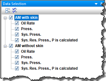
When an axis is added, if it has the same units as an existing axis, they are linked (default setting). - When any plot is pasted to the comparison plot, all datasets coming from the same plot are grouped together under a parent node in the Data Selection pane. By default, these nodes are the parent name to the originating well / group name, but they can be renamed (for example, to indicate where the data was originally copied from).
-
- Paste dataset
- Enabled only if a dataset is currently in the clipboard.
- Pastes the dataset in the clipboard of the current tab.
When an axis is added, if it has the same units as an existing axis, they are linked (default setting).
Note: When you hover over the dataset in the plot, the tooltip has the name of the node, followed by the name of the dataset (for example, AM with skin: Oil Rate). You can rename the dataset by right-clicking the plot and selecting Customize Dataset, but the tooltip retains the name of the parent node.
For a description of common plot context menus, see plot components.
Reporting sub-tab
In the Reporting sub-tab, report sets are created to print your specified worksheets using the Report Format you select. Report sets are database specific, and are shared between users connecting to the same database, with the last-saved action persisting. Each report set can include multiple items with no hard limit. The report set and its meta-data are automatically saved when you navigate away.
| Note: | Reports of plot and analysis parameters have been designed to fit up to nine analyses on the first page, and additional analyses are printed on subsequent pages. |
Clicking the Print or Preview buttons prints the active report set for the entities selected (wells and groups).
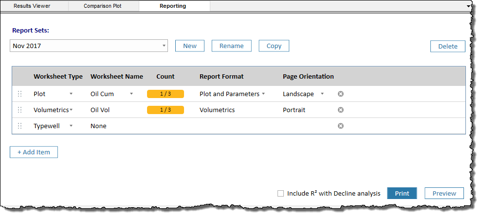
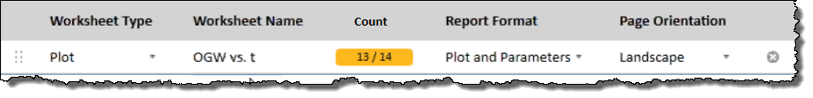
If you select multiple entities in the Entity Viewer, a subset of the selection may not have the specified worksheet. If this happens, a warning is displayed to the right of the Worksheet Name column. In this example, 13 of the 14 entities have the specified worksheet name. In the same manner, errors are also displayed to the right of the Worksheet Name column.
These items are defined as follows:
Report Sets — select your previously saved report sets from the drop-down list. If you have not created a report set yet, this drop-down list is blank.
New button — type a name for your report set.
Rename button — type a new name for the currently selected report set.
Copy button — creates a copy of the currently selected report set. Type a unique name for this copied report set.
Delete button — deletes the currently selected report set. You are not prompted to confirm the deletion.
 button — enables you to rearrange rows in your table by dragging-and-dropping.
Worksheet Type column — select Forecast, Plot, Typewell, or Volumetrics.
Note: The reporting feature only supports worksheet types that are created with the Harmony Forecast™ license. Additionally, when you select Plot, worksheets for Decline, Ratio Analysis, or Custom can be used.
Worksheet Name column — select from your list of worksheet names. If you do not have a worksheet for the Worksheet Type you selected, this column displays None. The Worksheet Name drop-down list is blank until you create a worksheet that corresponds with your Worksheet Type selection. If there is only one worksheet that corresponds with your Worksheet Type, it is automatically selected.
Report Format column — if you selected Plot from the Worksheet Type drop-down list, you can select Plot, Parameters, or Plot and Parameters from this drop-down list. Otherwise, this column is not editable because only one report format is supported.
Page Orientation column — select either Portrait or Landscape. For Plot and Typewell worksheets, the default orientation is Landscape; otherwise the default is Portrait.
![]() Delete icon — deletes the currently selected item / row in the table. Note that this icon is only visible after you have added at least one item in the Report Set table.
Delete icon — deletes the currently selected item / row in the table. Note that this icon is only visible after you have added at least one item in the Report Set table.
+ Add Item — adds a table row where you can specify your Worksheet Type, Worksheet Name, Report Format, and Page Orientation, by selecting from the drop-down lists.
Include R2 with Decline analysis — click this checkbox to include the R2 parameter in your reports for Report Formats set to Parameters or Plot and Parameters.
Print — prints the currently selected report set. Entities are printed in the same top-to-bottom order as the Entity Viewer (Hierarchy or Custom), and worksheets for an entity are printed in the same order as the report-set table. Plots are formatted as they look in the Analysis tab.
Preview — opens a Preview window where you can adjust your view, page setup, and print options for the currently selected report set. Entities are displayed in the same top-to-bottom order as the Entity Viewer (Hierarchy or Custom), and worksheets for an entity are displayed in the same order as the report-set table. If you open and close the Preview window, when you open it again, it opens to the last page where you left off.
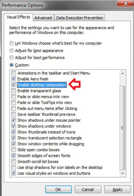
| Tip: | (Windows 7) If your Preview window opens without a Close Window button, make sure that the Enable desktop composition option is deselected in your Performance Options dialog box (see your Windows help for more information). |