On many of Harmony’s plots (for example, analysis plot-style worksheets and the Results Viewer cross-plot), you can add a diagnostic line, which is useful for identifying and extrapolating trends in the data.
To add a diagnostic line, click the Add a Diagnostic Line icon ( ) on the toolbar.
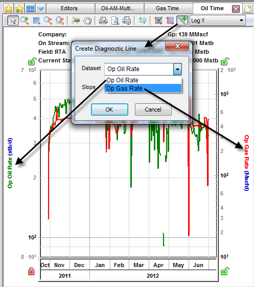
A diagnostic line requires at least one dataset or forecast. If there are multiple datasets, a popup opens where you can associate the diagnostic line with a data series. If that data series has one of its axes scaled, the diagnostic line scales with it.
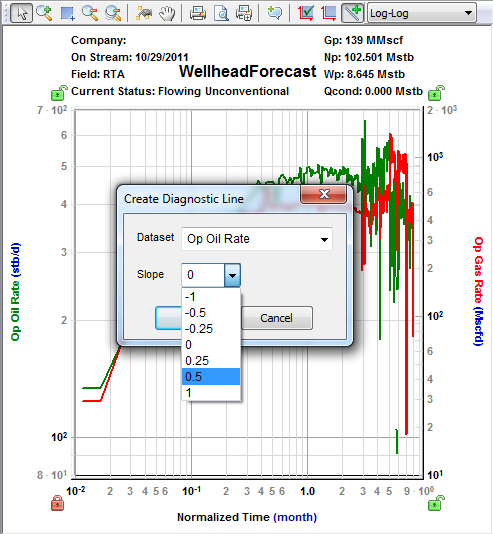
If the plot’s vertical and horizontal axes are both set to use logarithmic scales (that is, if the plot is “log-log”), when you click the Add a Diagnostic Line icon, a popup opens where you can select a preset value.
Right-clicking the diagnostic line lists these options:
You can manipulate the diagnostic line as follows:
IHS Harmony™ 2016b Multi-User | Last revised: October 19, 2016
Copyright © 2016 IHS Inc.