The Results tab consists of two sub-tabs: the Results Viewer and Comparison Plot. (The Results Viewer opens when you click the Results tab.)
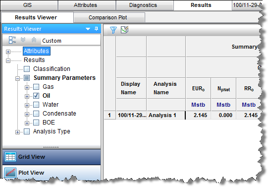
The Results Viewer has two buttons at the bottom of its pane: Grid View and Plot View.
The Grid View displays attributes and results in a table / grid based on selections in the Entity Viewer - Hierarchy or Custom Groups panes. As you change selections, the grid columns are retained, but the entities and their analyses are updated.
The grid is empty until you select attributes and parameters to be displayed. Columns are added to the grid by selecting checkboxes from the tree structure on the left. After you have created a selection of columns in the grid and customized them, you can save it as a template by selecting Save / Delete Template from the drop-down list above the tree structure.
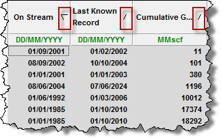
Clicking a column header sorts the table data by its attribute value, according to the same sorting rules MS Excel uses. For alphanumeric attributes, numbers are sorted first from left-to-right (instead of top-to-bottom), then special characters, and finally letters. Apostrophes and hyphens are ignored except when there is text with a hyphen. In this case, the text with the hyphen is sorted last. If you click a column header, and then press the Ctrl key, you can sort multiple columns at the same time. This is indicated by a sorting arrow in each of the columns.
The Plot View displays the axis parameters you select from the tree structure in a plot; you can plot attribute and result values, and a cross plot is used to analyze relationships between input and output parameters. If you are only plotting attribute values, you do not need to perform an analysis. For a description of plot options, see plot components.
To build the plot for the currently selected entity, select the parameters / datasets you want to display by selecting the appropriate checkboxes in the Results Viewer pane (tree structure). Or, you can drag-and-drop the parameters to the plot.
Tip: You can send your plot to a comparison plot, by right-clicking it and selecting Send Plot to Comparison Plot, or you can right-click and select Send Dataset to Comparison Plot. For information on other options, see plot options.
The important icons are described below. For a description of common icons, see toolbars.
 Advanced filtering — lists the analysis names that exist for the currently selected entities. Deselecting an analysis name removes all analyses of that name from the plot or grid for all entities. By default, all analyses associated with the selected entities are displayed.
Right-clicking the top left of your table lists these options:
Right-clicking table headers lists these options:
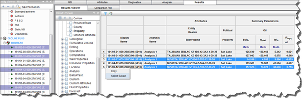
After selecting one or more rows in your table, you can right-click the row numbers to the left and select Select Subset. This removes the other rows in the table, and this selection persists across Harmony (for example, the Entity Viewer, GIS map, and so on).
By right-clicking a table cell, you can copy / paste the table cell's contents.
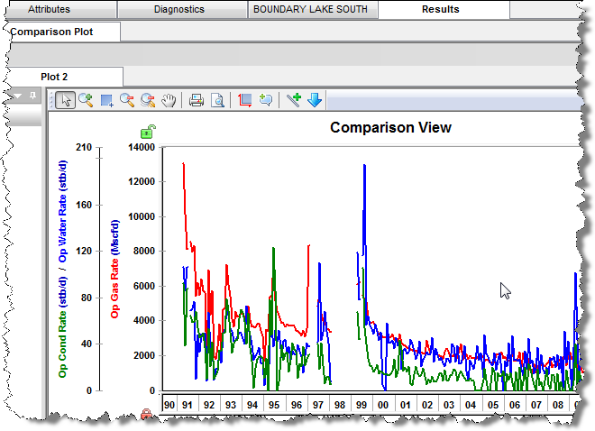
In the Comparison plot, you can combine plots and/or datasets from many Harmony plots. Comparison plots are static (a snapshot of a point in time), meaning that the plot does not change even if the source plot / dataset is modified. This can be useful to compare plots of slightly modified datasets, and to compare analyses between entities. Each tab in the Comparison plot contains a separate plot.
Plots created within the Comparison Plot tab are user-specific, meaning they are not shared with other users. The plot and its axes and datasets can be customized, and these changes persist with each plot (such as line / symbol properties, axis title, color, and so on).
The unique icons are as follows:
For a description of common icons, see plot toolbars.
Right-clicking the tab below the toolbar lists these options:
Right-clicking within a plot lists these options:
For a description of common plot context menus, see plot components.
IHS Harmony™ 2016b Multi-User | Last revised: October 19, 2016
Copyright © 2016 IHS Inc.