Diagnostic Lines
On many of Harmony’s plots, you can add diagnostic lines, which are useful for identifying and extrapolating trends in the data. To add a diagnostic line, click the Add a Diagnostic Line icon ( ) on the toolbar. This icon is available on decline worksheets, custom plots, ratio analyses, surveillance plots, probabilistic analyses on the cross-plot, and the results viewer plot view. Note that you can also send diagnostic lines to the comparison plot. For additional information, see the Diagnostic Lines video (opens in a new window, mp4 file).
This functionality was developed in slightly different ways for different parts of Harmony, and these differences are described below.
Log-Log Diagnostic Lines for Analytical Models and Unconventional Reservoir Model (URM) Plots
In production data analysis, specific data is often plotted on a log-log plot with the expectation that the data will fall in a straight line with a specific slope that is associated with certain reservoir flow regimes. These flow regimes are:
- zero slope for radial flow
- +/- quarter-slope for bi-linear flow
- +/- half-slope for linear flow
- +/- unit slope for boundary-dominated flow
For certain log-log plots (a complete list is given below), there is a convenient way of identifying these slopes by using the log-log diagnostic lines feature.
Plots Supported by Log-Log Diagnostic Lines
These analytical models have plots supported by log-log diagnostic lines:
- Production: Blasingame, Agarwal
- Typecurves: Typecurve Plot, Dim TC Plot
The unconventional reservoir model (URM) supports the Typecurve plot.
Adding a Diagnostic Line on the Typecurve Plot
To add a diagnostic line on the typecurve plot:
1. Open one of the supported plots and click the Add a Diagnostic Line () icon.
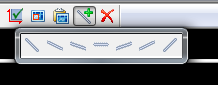
2. Right-click the line and select one of the slopes available from the sub-menu (ranging from a negative unit slope to a positive unit slope).
A diagnostic line is added on the log-log plot.
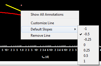
3. Right-click the line to change the following options:
- Show All Annotations — shows the x and y coordinates for both endpoints, as well as the slope of the line, denoted by 'm'.
- Customize Line — for changing the line width and color.
- Default Slopes — useful for verifying the slope of an existing line, or for changing that line's slope.
- Remove Line — will delete the line from the plot.
Line Controls: Once a line has been created, its slope cannot be changed by manipulating the line. To change the slope, right-click the line and select your slope from the sub-menu. The center of the diagnostic line can be dragged to move its location, and the endpoints can be moved to make the line longer or shorter, as desired.
Scaling: The axes of the log-log plot may be adjusted as desired, and the log-log diagnostic lines will scale to maintain their intended slopes.
Diagnostic Lines in DeclinePlus Plots
The Add a Diagnostic Line icon () is available on the toolbar for the following plots:
- DeclinePlus: Decline worksheet, Ratio Analysis worksheet, Custom worksheet
- Results tab >> Results Viewer >> Plot View (in cross-plot mode)
Adding a Diagnostic Line on DeclinePlus Plots
To add a diagnostic line on DeclinePlus plots:
1. Open one of the supported plots, and click the Add a Diagnostic Line icon ().
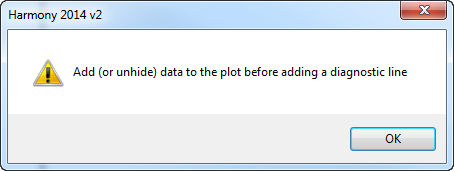
If the plot contains no data, you’ll get a warning message to add or show data before adding a diagnostic line.
If the plot contains a single data series (e.g., Op Gas Rate, or Op Oil Rate), a diagnostic line will be drawn immediately. Every time that you click the icon, another line will be created.
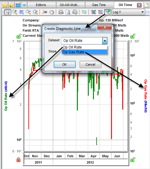
If the plot contains a multiple data series (e.g., Op Gas Rate and Op Oil Rate), a popup will open enabling you to associate the diagnostic line with a data series, so that if that data series has one of its axes scaled, the diagnostic line will scale with it. If you are unsure of what to choose, select the main production dataset of interest (e.g., Op Oil Rate).
Even if there's only one dataset on the plot, if there are non-decline forecasts (i.e., analytical or numerical forecasts), when you click the Add a Diagnostic Line icon, a popup will prompt you to associate the diagnostic line with either a dataset or a forecast. We recommend that you associate the diagnostic line with a dataset because if you associate the line with a forecast, the diagnostic line will disappear if you toggle the forecast checkbox in the Analysis Manager. The diagnostic line will persist if you associate it with a dataset.
If the plot’s vertical and horizontal axes are both set to use logarithmic scales (i.e., if the plot is “log-log”), when you click the Add a Diagnostic Line icon, a popup will prompt you to select a fixed-value initial slope.

2. After adding a diagnostic line on the plots, you can change slopes by using standard line controls. See Manipulating the Decline Curve for additional information.
3. Right-click the line to change the following options:
- Show All Annotations — shows the x,y coordinates for both endpoints, as well as the slope of the line, denoted by 'm'.
- Customize Line — for changing the line width and color.
- Default Slopes — only shown for log-log plots.
- Remove Line — will delete the line from the plot.