Data Management Tab
Subtopics:
Related Topics:
The Data Management tab houses raw data and contains tools to prepare your data for analysis.
There are five sub-tabs within the Data Management tab, which are described below.
Data Sub-tab
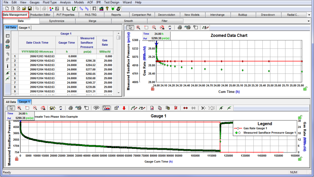
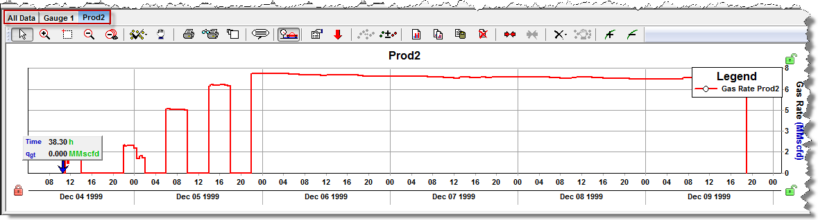
The Data sub-tab stores a copy of the imported gauges, as well as any datasets created from merging multiple gauges, or smoothing data within a gauge. All imported data is automatically displayed in a table with a corresponding plot. The data tables and plots work together to display information efficiently. When you click a point on a plot, the plot's data marker moves to the nearest data point, and the corresponding row in the data table is highlighted in blue. Likewise, when you select a row in the data table, the marker on the plot moves to the data point, which corresponds to that row. Both the data tables and plots have tools to help navigate to specific points, or to manipulate data.
The plots within the Data sub-tab enable you view and manipulate data.
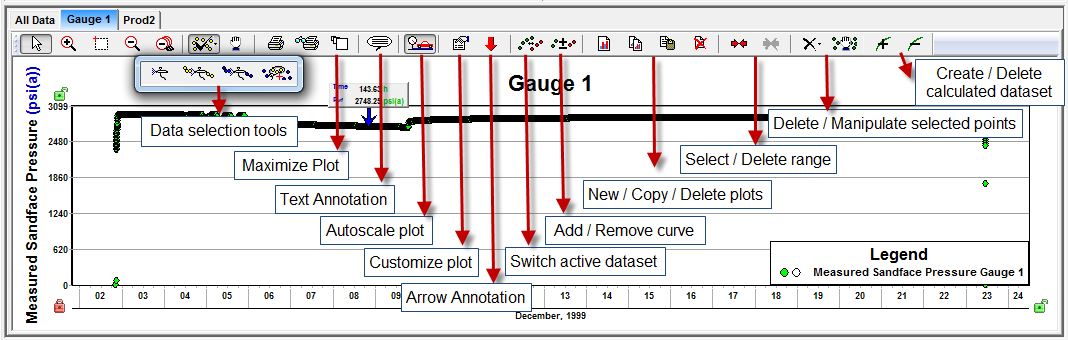
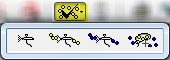
- Data Selection Tools — Spray Select, or Rope Select icons can be clicked to select or deselect data points. Selected data can be deleted or manipulated graphically using the appropriate icons near the end of the plot's toolbar.
- Switch Active Dataset — This option is active on plots displaying more than one curve. It controls which dataset the zoomed plot displays and the plots marker it is attached to.
- Select / Delete range — Range markers may also be used to select data. The Delete option enables you to remove all points within or outside a selected range.
- Delete selected points — The Delete option has a sub-toolbar with options to remove data selected on the active dataset, on all datasets within the gauge, or inside / outside a selected range.
- Manipulate selected points — Selected data can manipulated by adding, subtracting, multiplying, or dividing by a constant.
- Create calculated dataset — Datasets can be calculated based on the difference or average of like data types from two different gauges. For example, a pressure comparison dataset can be generated by calculating the difference between the pressure values from tandem sandface gauges. The primary pressure derivative of pressure datasets can also be calculated.
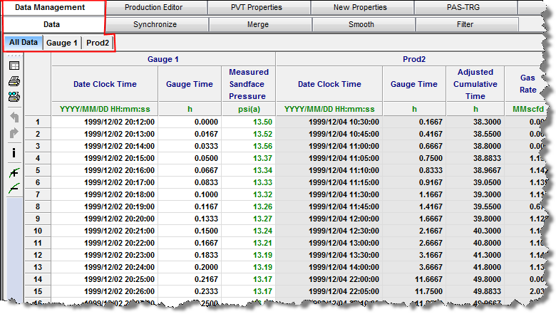
The top left pane contains tabs of data tables for each imported gauge, and an all data table of all imported data.
The bottom pane contains tabs of plots for each imported gauge and an all data plot.
- To add new plots, click the New Plots icon (
 ) on the toolbar.
 - To add or remove data from any plot, select or deselect data points by clicking the checkmark icon
 and selecting the appropriate .toolbar option.
 - To calculate datasets, click the Create calculated dataset (
 ) icon. Note that it is common to create a gauge comparison plot if tandem recorders are run downhill.
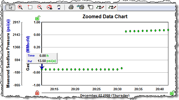
The top right pane displays the active dataset in the Zoomed Data Chart.
Synchronize Sub-tab
In the Synchronize sub-tab, you can synchronize data from different gauges, or datasets contained within a single gauge.
| Note: | To open this sub-tab, at least two valid gauges, or two datasets within one gauge must exist. |
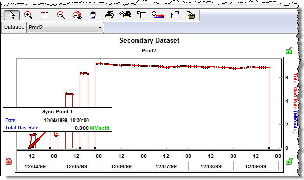
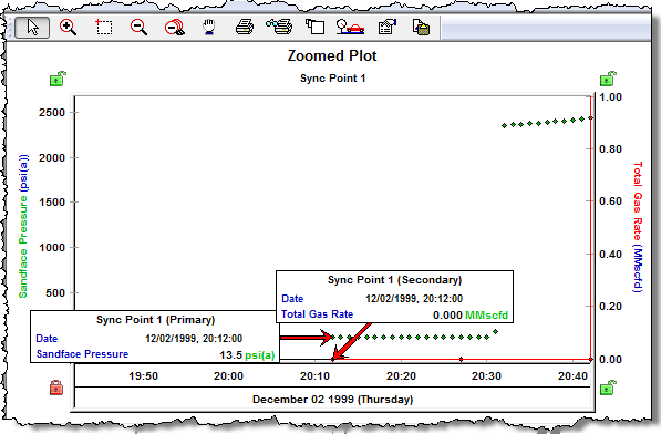
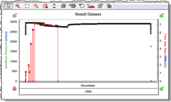
The synchronize view is divided into four plots.
The top left pane displays the primary plot, and the data in this plot stays where it is.
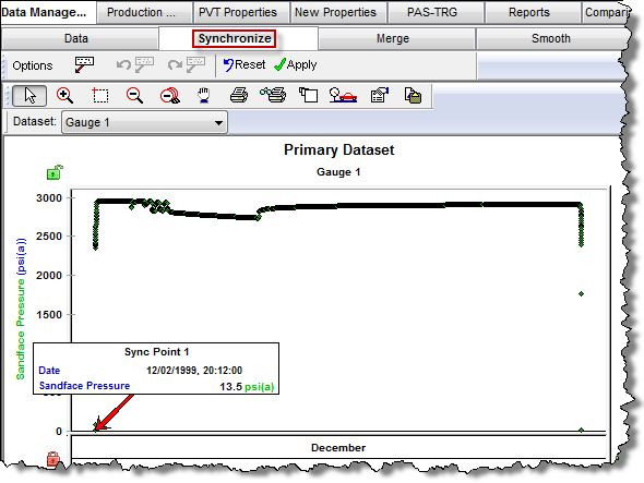
The bottom left pane displays the secondary dataset. The data in this plot will shift when the Apply icon (![]() ) on the primary dataset toolbar is clicked.
) on the primary dataset toolbar is clicked.
The top right pane displays the zoomed plot.
The bottom right pane displays the results plot, which illustrates what the data would look like when the Apply icon on the primary dataset is clicked.
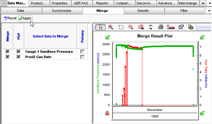
Merge Sub-tab
Data from different gauges (i.e., imported from different files) can be merged into one continuous file by clicking the Merge sub-tab.
| Note: | To open this sub-tab, at least two valid gauges must exist. |
In the Merge tab, you can select the datasets to be merged and view the result of the merge on the plot.
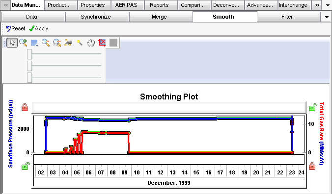
Smooth Sub-tab
Datasets contained within a gauge can be smoothed by clicking the Smooth sub-tab. This tab contains a plot displaying the data points and a smoothed line for each curve. It also has three sliders: the middle one smooths the active curve, and the left and right ones control the degree of smoothing on the left and right edges of the selected period.
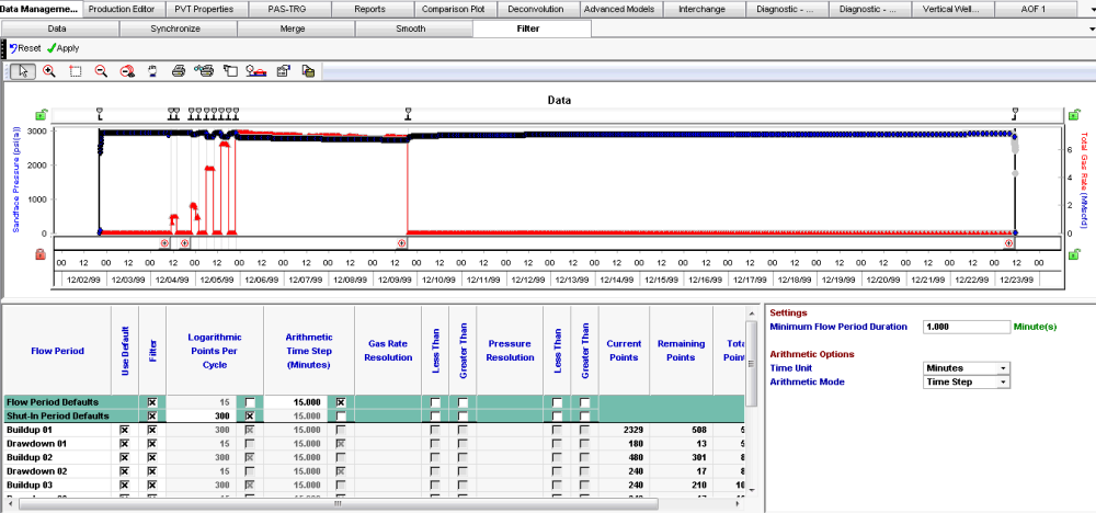
Filter Sub-tab
Datasets contained within a gauge can be reduced / smoothed using a combination of time and resolution filters by clicking the Filter sub-tab. This tab contains a plot, which displays the original points, and the points that would be kept, under the current filtering conditions, if the Apply icon was clicked. It also contains a table for defining the filtering conditions. In the top two rows, you can specify default filtering conditions for each flow and shut-in period. There are also rows for each flow and shut-in, so you can customize the filtering condition for each flow and shut-in period.