Results Tab
The Results tab displays the results of well analyses. Consequently, this tab displays no content until one or more analyses have been performed. After an analysis has been run, the results can be viewed, printed, and exported.
Below the Results tab are the following sub-tabs:
Results Viewer Tab
The Results Viewer tab, located under the Results tab, contains the results of all of the analyses performed in Harmony. These results can be viewed in tabular form (Grid View), or by using different multiple plot types (Plot View).
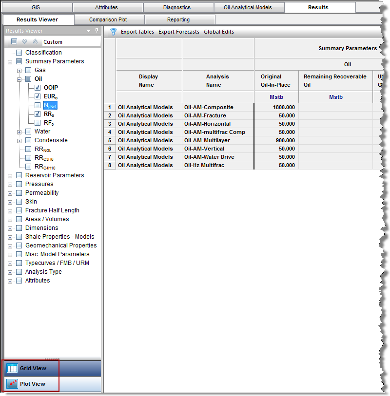
Grid View
Click the Grid View button, and then click the checkboxes in the selection tree on the left to add or remove results from the table. Note that table rows are displayed in the order that checkboxes are clicked in the Results Viewer selection tree.
Clicking one or more entities (e.g., wells, groups, or layers) in the Entity Viewer that have been analyzed displays the analysis results using a selection tree on the left and a table view (grid system) on the right. When you select a well, a default selection of data results is displayed. Clicking a column header sorts the table data by its attribute value, according to the same sorting rules that MS Excel uses (i.e., for alphanumeric attributes, numbers are sorted first from left-to-right (instead of top-to-bottom), then special characters, and finally letters. Apostrophes and hyphens are ignored except when there is text with a hyphen. In this case, the text with the hyphen is sorted last).
Grid View has four options on its toolbar: advanced filtering, export tables, export forecasts, and global edits.
Advanced Filtering
Advanced filtering allows you to filter the results in the table to display only specific analysis types / names. The selections that you make will also apply to the data displayed on the Plot View. See Filtering Results by Analysis Type for additional information.
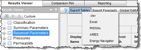
Export Tables
Clicking Export Tables opens a drop-down menu of the different file formats you can export data to. For more information, see Exporting Tables.
Export Forecasts
By clicking Export Forecasts, you can export all currently shown analyses in the Results Viewer as a .csv file. For more information, see Exporting Forecasts.
Global Edits
By clicking Global Edits, you can bulk edit specific decline parameters for selected analyses. See Making Global Edits for additional information.
Note: Global edits only apply to decline analyses. Therefore, you must create one or more decline analyses before using this feature.
Plot View
Click the Plot View button to see your data results in a variety of plots.
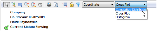
Similar to Grid View, only the analysis data from selected entities in the Entity Viewer is displayed. There are three plot types: cumulative distribution function, cross plot, and histogram.
Cumulative Distribution Function
A cumulative distribution function (CDF) calculates the probability that a random variable with a given probability distribution will be found at a value less than or equal to "x".
Only one result variable can be plotted on a CDF plot at a time, and results can only be added by clicking the appropriate checkboxes in the selection tree on the left. If a result variable is already selected, making another selection will replace the current selection.
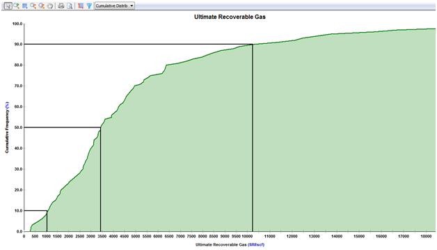
The black horizontal lines originating at cumulative frequencies of 10%, 50%, and 90% intersect the CDF curve, and then line up with the P90, P50, and P10 values of that dataset, respectively.
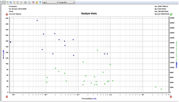
Cross Plot
A cross plot displays data as a collection of points, each having the value of one variable determining the position on the horizontal axis, and the value of the other variable determining the position on the vertical axis. This is also known as a scatter plot. These plots are most commonly used for identifying trends or relationships between different variables.
Results can be added to the cross plot by clicking the checkboxes in the selection tree, or by dragging results to the desired axis. Multiple results can be plotted on the y axes, but only one result can be plotted on the x axis at a time. (Date variables can only be plotted on the x axis.)
Histogram
A histogram is a graphical representation of a distribution of data. It is an estimate of the probability distribution of a continuous variable. The dataset is split up into bins (ranges) on the x axis, and the y axis plots the frequency at which the data falls in each bin.
Only one result variable can be plotted on a histogram at a time. Results can only be added to a histogram by clicking the checkboxes in the selection tree. If a result variable is already selected, making another selection will replace the current selection.
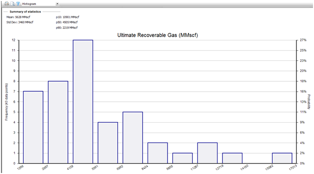
A summary of statistics is displayed just above the histogram. This summary calculates the mean, standard deviation, and P10 / P50 / P90 values of the selected dataset.
Plot Templates
Plot templates can be created and saved using the same procedures as Diagnostics templates. See Creating a Custom Plot Template for additional information.
Templates created in the Plot View will store the following information:
- Plot type
- Selected results in the selection tree
- Most plot customizations
Note: Templates created in the Plot View cannot be accessed in the Grid View, and vice versa. Plot templates and grid templates are independent.
Comparison Plot Tab
With the Comparison plot, you can create plots for comparison by layering individual plots from within IHS Harmony. Comparison plots are static, meaning that the plot does not change even if the dataset is modified. This can be useful to compare plots of slightly modified datasets. Each tab in the Comparison plot contains a separate plot.
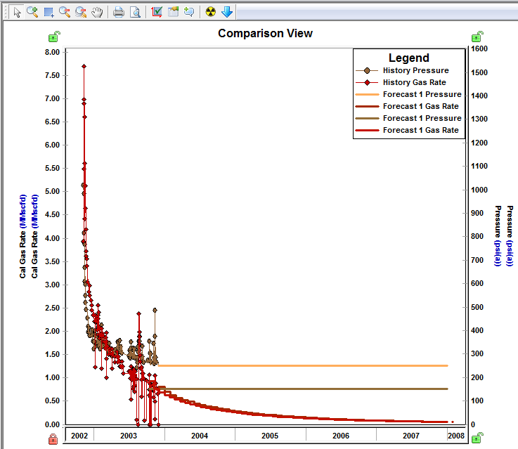
Note: If the plots use the same units on their axes, the axes are merged.
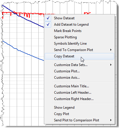
If you want to copy a single dataset from a plot rather than all data on the plot, right-click the dataset (not the plot) and select Copy Dataset and then Paste Dataset.
Note: Comparison plots can be manipulated in the same ways as other plots in the software.
To create a new plot tab, click
the New icon (![]() ) on the toolbar. You can also create a new plot tab using the Send
Plot to Comparison Plot > New
Plot option on the Diagnostics
tab.
) on the toolbar. You can also create a new plot tab using the Send
Plot to Comparison Plot > New
Plot option on the Diagnostics
tab.
Reporting Tab
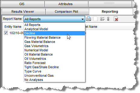
The Reporting tab is used as a print queue to batch print reports from multiple entities. Reports are displayed in a table that displays the entity name, report name (as shown in the Print menu for the worksheet), and worksheet name. Queued reports can be filtered based on analysis type using the drop-down menu in the toolbar.
You can sort reports by clicking a category heading:
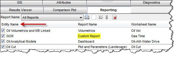
Note: If you've created a custom report(s), it can be added to the print queue as well; an example of this is shown above.
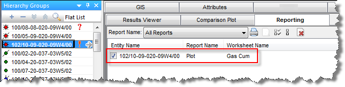
When a well is selected in the Entity Viewer, only the queued reports for that well is displayed in the print queue.
By default, all worksheets are added to the print queue. Reports in the print queue have a dynamic link to the worksheet, so that the current version of the worksheet is always printed. In this way, if projects are updated and analyses revised over time, the same reports can be reprinted without any additional steps.
Note: The Print and Print Preview icons in the Reporting tab apply to all reports that are displayed in the print queue.